Satisfaction.
|
|
Artist and Inspiration
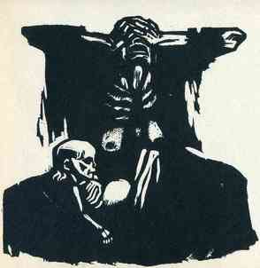
Kollwitz, Kathe. Hunger. 1923, Dallas Museum of Art, Dallas, Texas.
|
My first inspiration was Kathe Kollwitz’s Hunger, which shows the sorrow of a mother who lost her child to starvation. She created this piece to get the attention of other counties and ask for because Germany at the time was facing reparations from allied nations. Many of her pieces were an exploration of grief and they were often portrayed with dark contrasts. Her use of space is very minimalist where she add detail in important areas such as the child's face and the mothers ribs. These focal point make it easy for the viewer to understand the story behind the piece. Because grief was something that everyone experiences, I wanted to explored the idea of joy.
To explore the idea of joy, I looked into my second inspiration James Jean. Jean is a Taiwanese American, illustrator who focuses on the ideas of observation, memory and imagination. His art is heavily influenced by his own prejudices and biases. I was influenced by his art because if the unique color pallet and style each of his art pieces have. His color choice for his pieces can make an image overwhelming due to the brightness or the dullness. In other words, in many of his pieces he tries to use all the space possible but he still is able to add contrast to make the images recognizable. He uses his space very efficiently where the viewer can locate main focal points but discover many other hidden faces or objects around the piece. I wanted to create a piece that would show the mother and child reunited after death. I wanted to create a feeling similar to that of when one sees a loved one they haven't seen in a long time, almost like nostalgia. I decided to take the story from Kollwitz piece and continue it with a style like Jean, using as much space as possible to create a rendition of heaven or afterlife. |
Planning
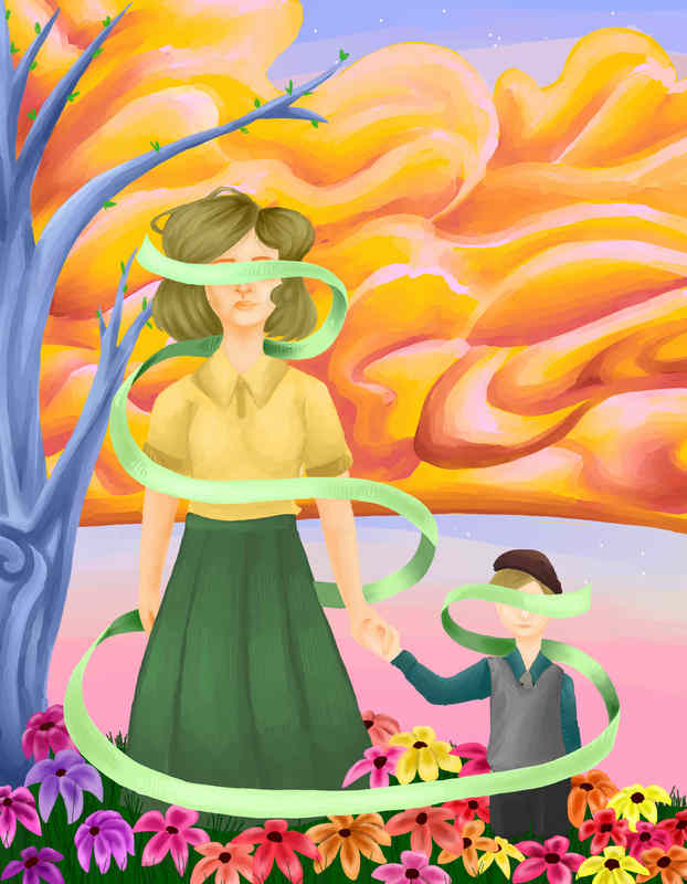
In the beginning, I was debating on whether or not to create a block print of what would have happened after the events of Hunger. I wanted to play around with the idea of heaven. I got this idea when looking at the black and white contrast of Hunger and decided to create something in color instead. Before I began the sketch I looked into the clothing style of the 1900´s. I created a sketch of what I thought the mother and child would look like after they were reunited after death. For my color inspiration, I used James Jean, a vietnamese visual artist who create surrealistic pieces with unique color palettes. I decided to incorporate a ribbon to hide the identity of the women and child similar to Hunger and I used up as much space as possible to create a crowded areas like Jean. This was mainly in the grass, flowers and sky. Using oranges and pinks, I made small cloud sketches to get a general sense of what I wanted the sky to look like and what values I should use. Many of the sketches were very similar, just with small details that were changed. But overall, I wanted to portray the mother and child reunited after death.
Process
|
|
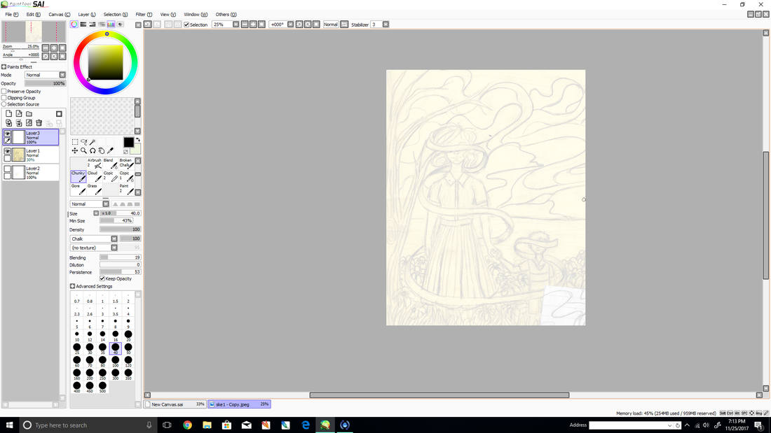
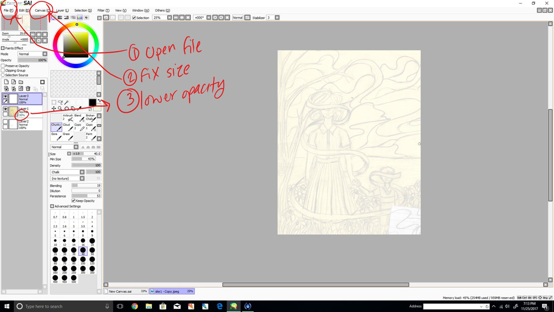
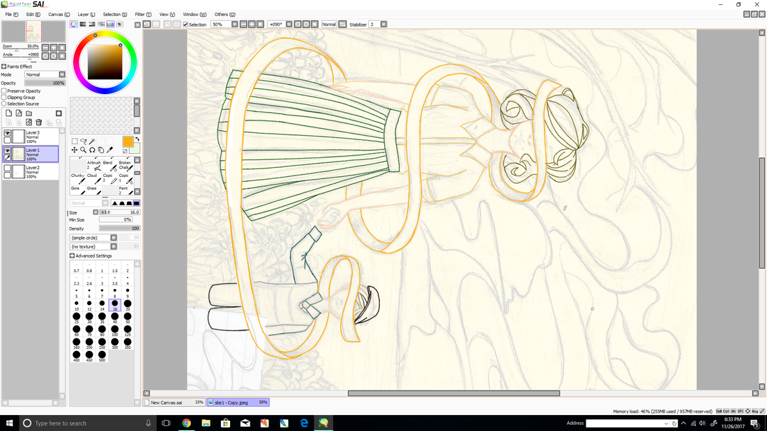
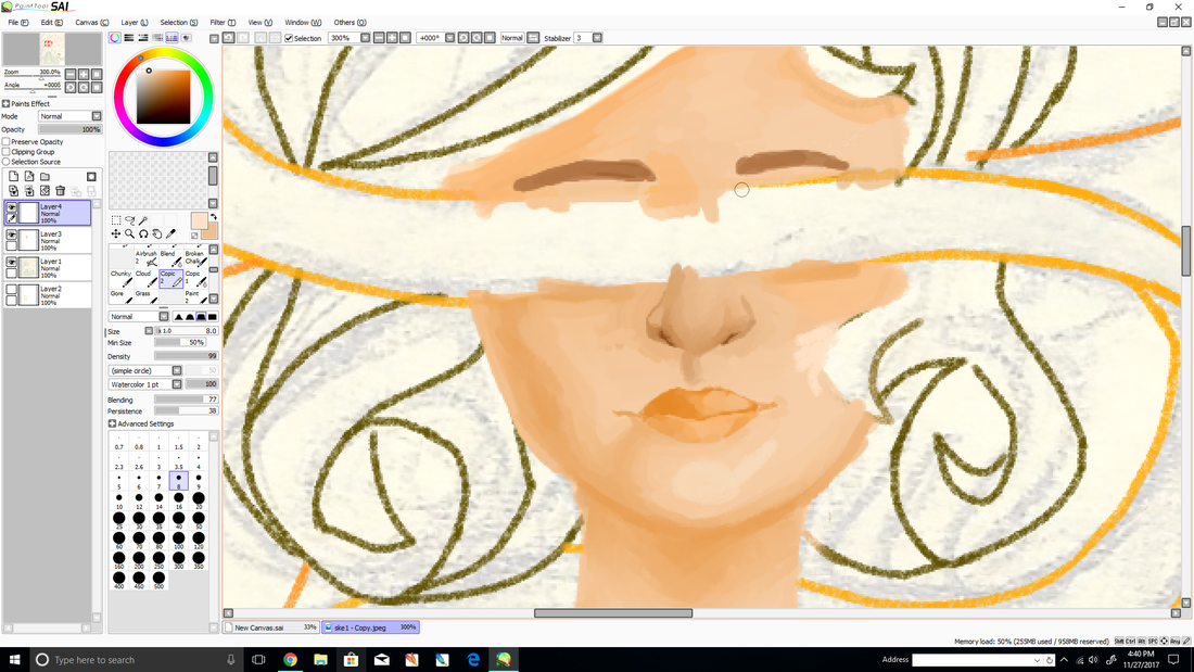
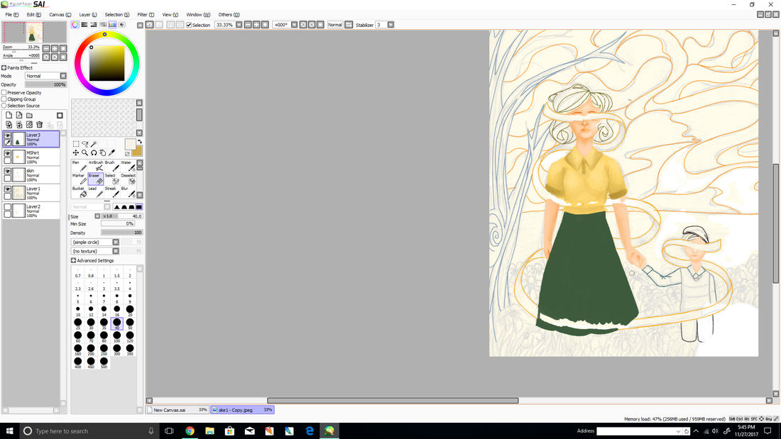
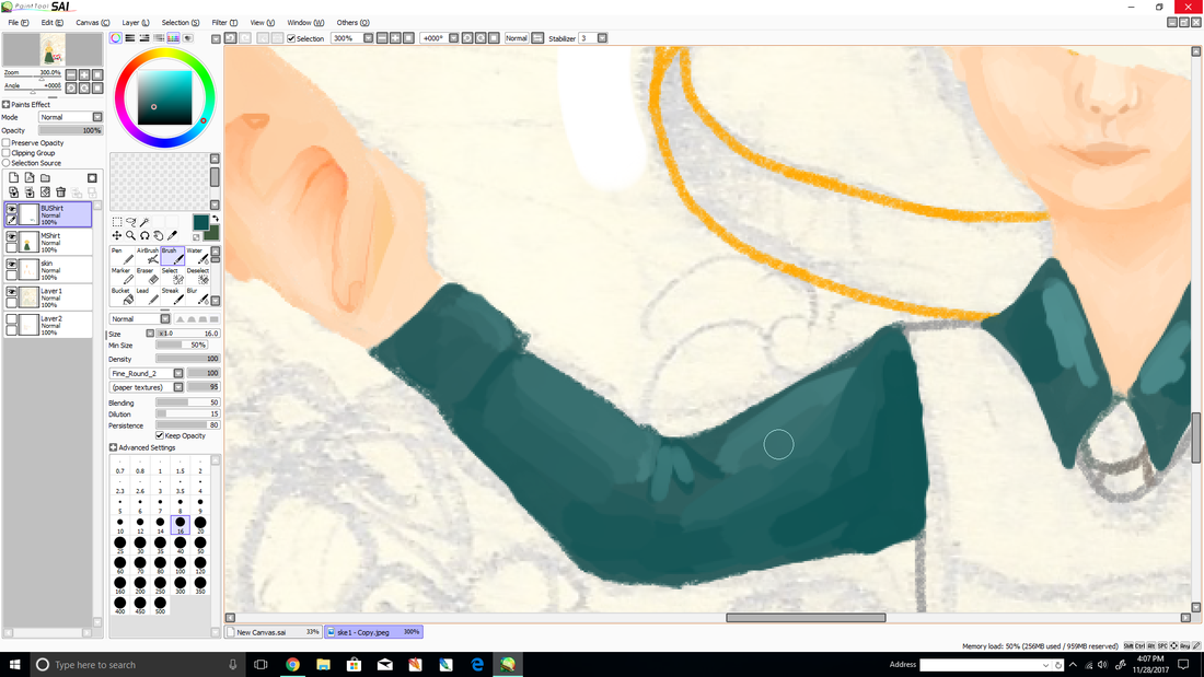
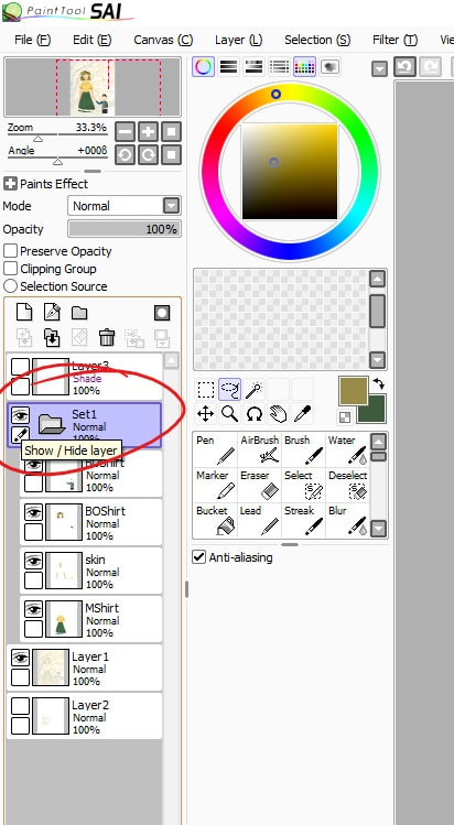
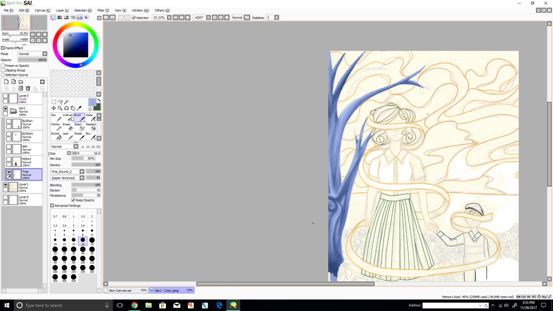
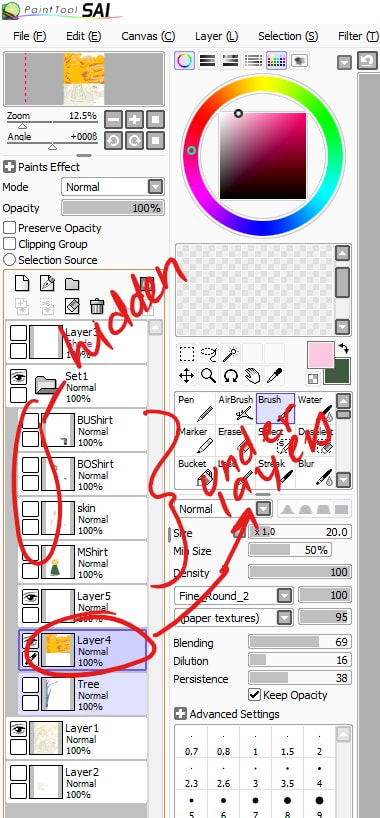
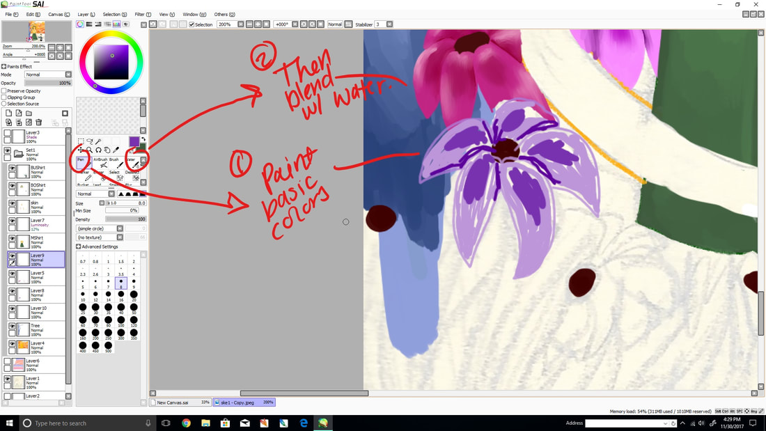
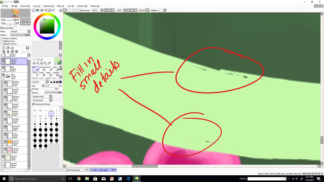
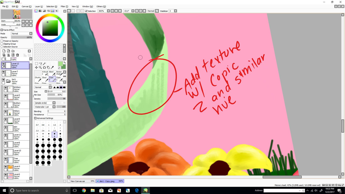
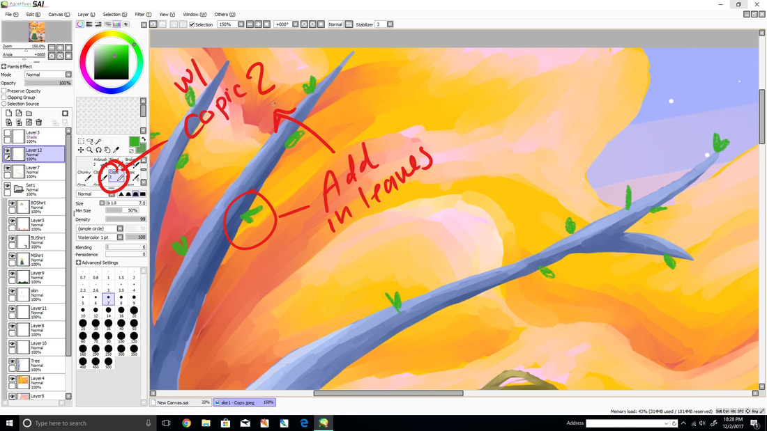
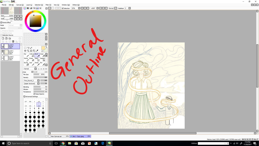
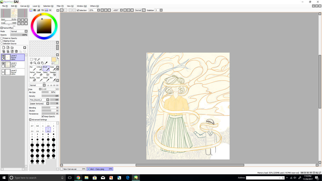
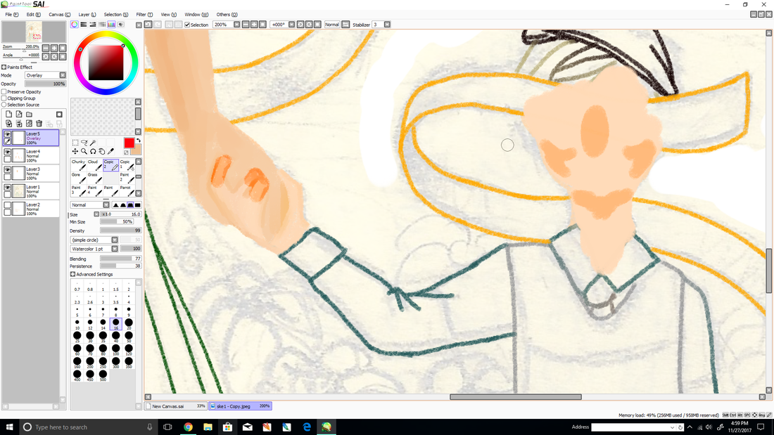
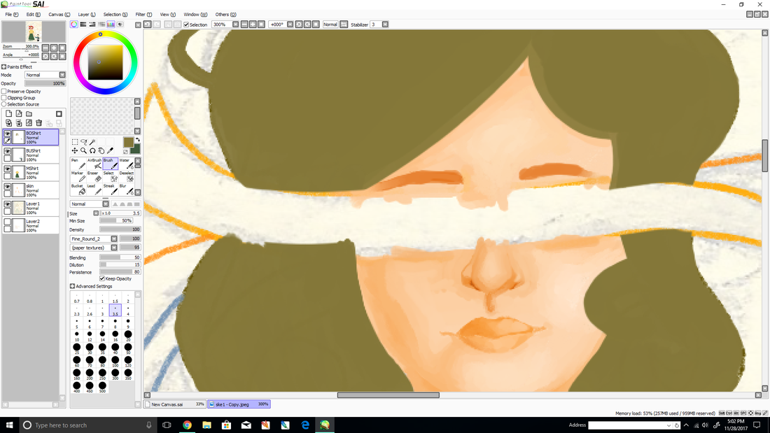
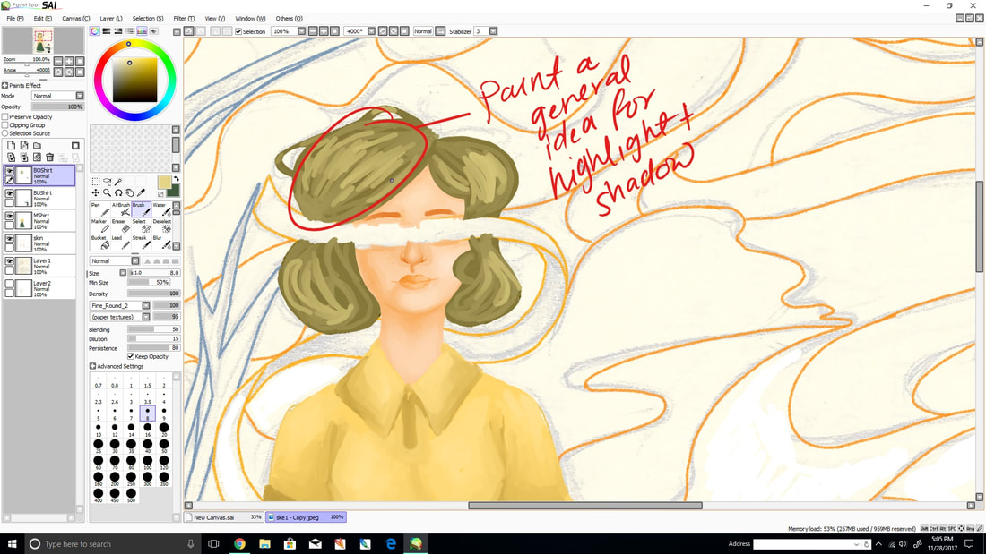
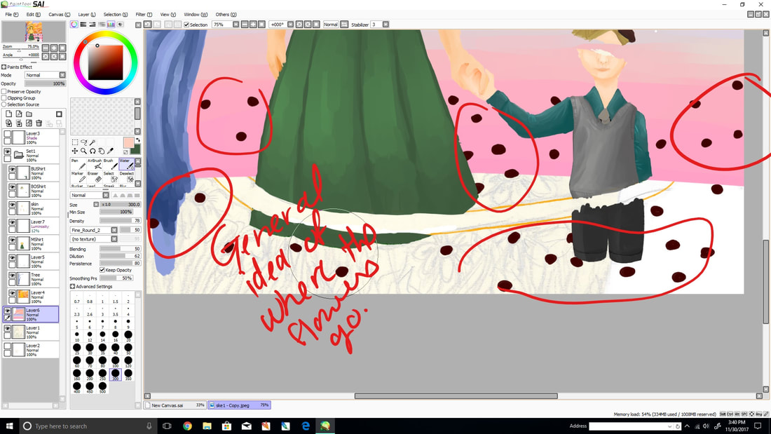
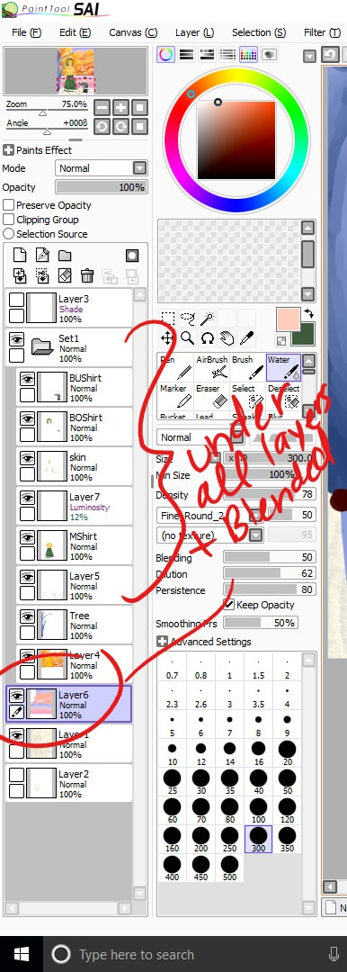
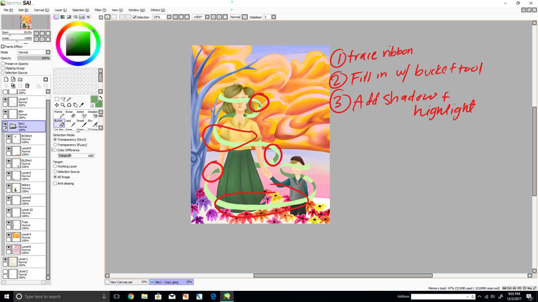
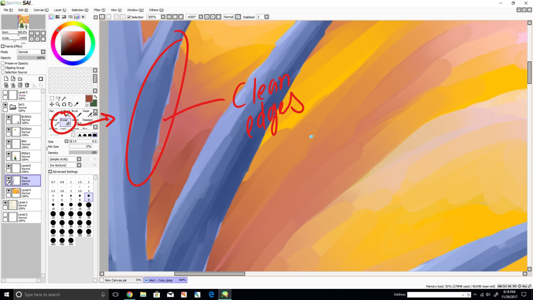
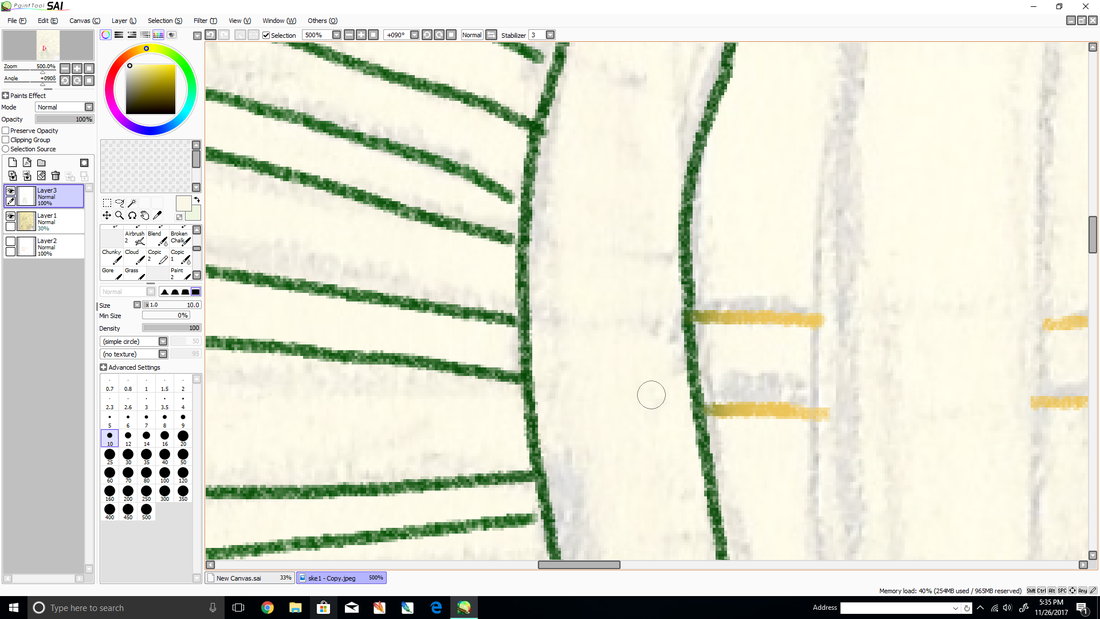
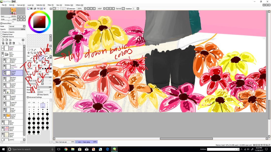
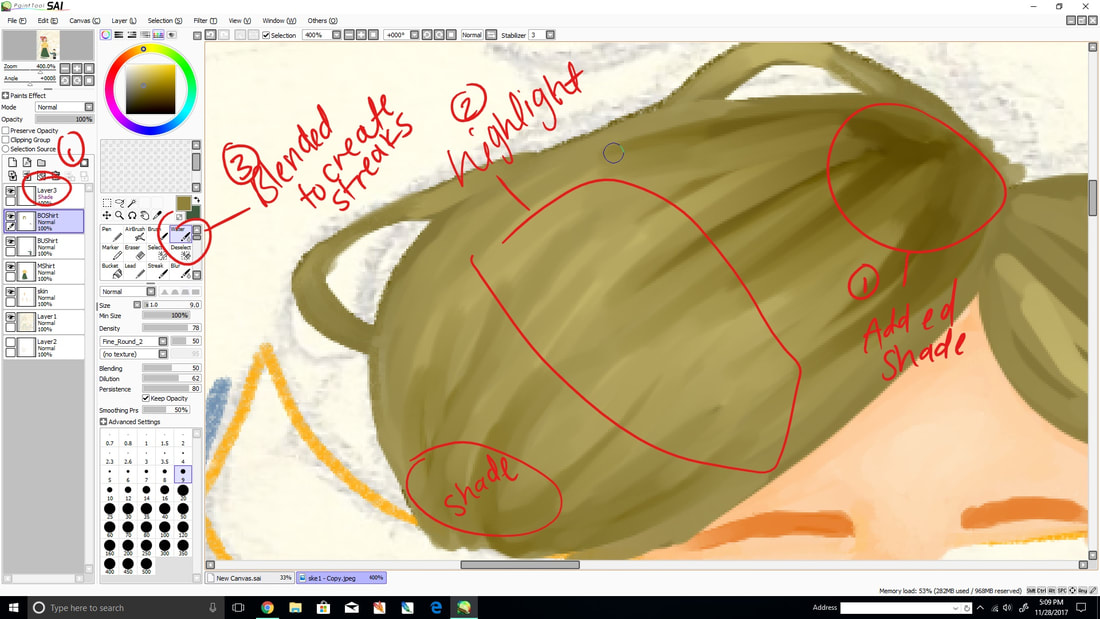
The first step to this process was uploaded the sketch I wanted to use. Then I resized it to the canvas size I wanted to use. Using the Copic 2 brush, I outlined the image in order to get a general idea of what the colors for that area were going to be and make the image look cleaner. Switching to the standard brush with a low dilution, in a separate layer, I started with the skin by adding a base color. I then added darker hues to indicate the nose, mouth and other shadows. Using lighter values, I did the same for highlight. Switching occasionally from standard to the water brush, I blended the colors to create a slightly streaky yet smooth colors. Once the skin was done, I created a new layer and repeated the steps with the clothes and the hair for both figures, making sure those layers where above the skin layer. I organized the figure layers in a folder to avoid confusion. In order to do the background, I hid the layers that correspond with the figures and added a layer below the figure folder. By doing this, I won’t have to go back and erase or correct as much. I started with the sky by using a warm orange and a soft blue under the clouds. Having James Jean as reference, I used a thin brush to add highlights and shadows in the clouds by using different values of blues, oranges and pinks. After the sky layer was finished, a layer was added above the cloud layer and I used a faded, dark blue for the tree and lighter blues for the highlight. Using red I added flowers to the tree and green for leaves. I used separate layers for the flowers and the grass in the ground. I then looked over the image and added detail to where I felt like were lacking.
|

Experimentation
|
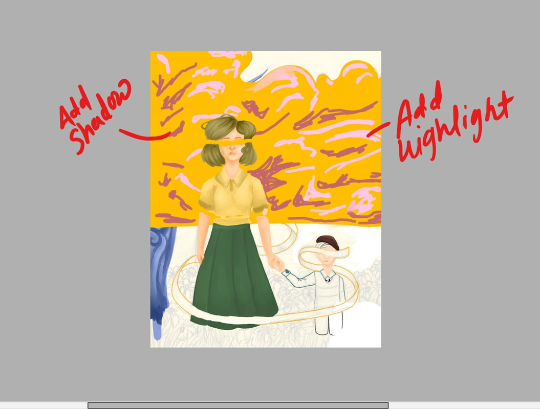
The main experimentation for this piece what color choice and technique. For the colors, when I felt the colors were too dark or if I felt like the hue and softness wasn’t enough, I would adjust the saturation and the contrast in the option for the that layer. I mainly did this for the clouds because after looking at the piece from afar, the maroon was darker than what I wanted it to be. I also adjusted the background color to try and compliment the colors in the foreground. As for technique, I tested each of the different brushes to decide which ones would work best for blending. Throughout the piece, I switched back and forth from the water brush and the regular brush depending on whether or not I was adding color or blending them. I used the Copic 2 brush for mainly the clothing but later realized that it didn’t really make a difference so I ended up only using it for some texture around the piece.
|
|

Reflection
Overall, I am satisfied with this piece because I was able to include all the mail details I wanted. I really liked how the tree and clouds turned out because i was able to blend the colors enough to give them a streaky texture. Something I would go back and experiment more on would be the flower and grass because I noticed that the colors look some what muddy. I would have defined the details of the flowers more and add a tint of orange to act as the reflection of the clouds. I would probably do the same with the ribbon since the mint hue looks a bit flat. Since I don't have much experience in painting full figures, it was difficult for me to define facial features and hands. I would be more careful when decided which values of skin tone to use because then it would be easier to distinguish the details instead of having to squint.
I enjoys playing around with color throughout this piece and studying the technique that James Jean used. It looked like he would use a graphite like brush to create an outline with a dark blue and then use a similar brush to add a base color. I used the same technique except instead of using a graphite brush to lay the base color I used the basic brush. Near the end, I added detail with a Copic 2 brush, which is similar to a graphite brush, to add texture in areas such as the ribbon or skirt. As for my inspiration, Kathe Kollwitz, i was mainly inspired by the mother and child. It remind me of maternal love and I wanted to create something opposite of what she did. Instead of creating a piece that involve grief and prominent contrast, i wanted to create something more nostalgic in a way. For instance, reuniting with a loved one. With this idea, I incorporated heaven since Hunger represented the death of a child, I wanted to make a continuation of the piece digitally when the mother and child see each other again after death.
I enjoys playing around with color throughout this piece and studying the technique that James Jean used. It looked like he would use a graphite like brush to create an outline with a dark blue and then use a similar brush to add a base color. I used the same technique except instead of using a graphite brush to lay the base color I used the basic brush. Near the end, I added detail with a Copic 2 brush, which is similar to a graphite brush, to add texture in areas such as the ribbon or skirt. As for my inspiration, Kathe Kollwitz, i was mainly inspired by the mother and child. It remind me of maternal love and I wanted to create something opposite of what she did. Instead of creating a piece that involve grief and prominent contrast, i wanted to create something more nostalgic in a way. For instance, reuniting with a loved one. With this idea, I incorporated heaven since Hunger represented the death of a child, I wanted to make a continuation of the piece digitally when the mother and child see each other again after death.
ACT Questions
1) How are you able to identify the cause-effect relationships between your inspiration and its effect upon your artwork?
I was influenced by Jean's crowded and colorful pieces. My piece was a rendition of what could happen after Kollwitz piece.
2) What is the overall approach the author has regarding the topic of your inspiration?
The author for Kollwitz was very formal and informative, describing the her influence and the reasons behind her piece.
3) What kind of generalizations and conclusions have you discovered about people, ideas, cultures, etc. while you researched your inspiration?
I can conclude that media, cartoons, and traditional styles can be combined to create unique pieces. They all have some influence in modern art.
4) What was the central idea for theme around your inspirational research?
My central idea was the uniting of families. Visually, it can be motherly love and anonymity because everyone can relate.
5) What kind of inferences did you make while reading your research?
I can infer that Jean's pieces can be difficult to interpret because they are influenced by his biases and can be overwhelming.
Bibliography
Jean, James. “Work.” James Jean, www.jamesjean.com/.
"Käthe Kollwitz | Memorial Sheet of Karl Liebknecht (Gedenkblatt Für Karl Liebknecht) (1919-1920) | Artsy." Käthe Kollwitz | Memorial Sheet of Karl Liebknecht (Gedenkblatt Für Karl Liebknecht) (1919-1920) | Artsy. N.p., n.d. Web. 03 Nov. 2016
"Käthe Kollwitz | Memorial Sheet of Karl Liebknecht (Gedenkblatt Für Karl Liebknecht) (1919-1920) | Artsy." Käthe Kollwitz | Memorial Sheet of Karl Liebknecht (Gedenkblatt Für Karl Liebknecht) (1919-1920) | Artsy. N.p., n.d. Web. 03 Nov. 2016
"Käthe Kollwitz | Memorial Sheet of Karl Liebknecht (Gedenkblatt Für Karl Liebknecht) (1919-1920) | Artsy." Käthe Kollwitz | Memorial Sheet of Karl Liebknecht (Gedenkblatt Für Karl Liebknecht) (1919-1920) | Artsy. N.p., n.d. Web. 03 Nov. 2016
"Käthe Kollwitz | Memorial Sheet of Karl Liebknecht (Gedenkblatt Für Karl Liebknecht) (1919-1920) | Artsy." Käthe Kollwitz | Memorial Sheet of Karl Liebknecht (Gedenkblatt Für Karl Liebknecht) (1919-1920) | Artsy. N.p., n.d. Web. 03 Nov. 2016
