Melt.
|
|
Artist and Inspiration
|
|
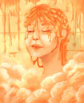
Salvador Dali’s “Soft Watch at the Moment of First Explosion” and “The Persistence of Memory” were created to create confusion and discredit the world of reality. He inspired me by having me think about the idea of time having a lot of power in reality but it loses power when a person is daydreaming. When someone daydreams, they tend to lose track of time, completely disregarding it. Hence, supporting the idea that time works differently in the dream world then in reality. The decaying or melting clocks are a symbol of time and the destruction it can bring. His art work made me think about how reality made time go much slower, sometimes making it dreadful. So, I thought of a time where a person feels relieved and wishes they could feel relieved and relax for a longer period of time. Eventually, realizing that they spent too much time relaxing. Then I found Ivan Alifan. His ‘Not Milk’ series are portraits of people who have a white substance dripping on their head. He created this series to decriminalize sex in art. In other words, help people not feel embarrassed or nervous when around erotic art. To do this he avoids rendering physical characteristics and focuses on the subtext. Some of portraits include "Porcelain Skin" and "Ceramic Skin" which I used as reference for my piece. The expressions of the people and the cool colors combined with Dali’s twisting of time, made me think about a hot shower after a stressful day. Since Dali’s piece was barren, giving the impression of a dessert, I decided that warmer tones would best suit my piece. I also was intrigued by the limited color values Alifan used in order to create and atmosphere and feeling in the viewer. The cool values gave off a cold feeling and one can almost feel the substance dripping on themselves. The highlights and reflections in the substance were something I paid close attention to because it was an aspect that many liquids had so I knew it was important to incorporate into the graphic image. |
Planning
Salvador Dali was the first artist I thought of because of his several melting clock art and so I started researching him, learning about how time can affect a person , eventually bringing destruction. Since I wanted to try doing a digital piece, I thought about different artist was familiar with later remembering Ivan Alifan and his 'Not Milk' series. Using both Dali and Alifan's artworks I sketched out three potential ideas. The first was of a smiling girl who was in the shower melting. This sketch was a representation of what a person feels like in a hot shower after a long, stressful day. I thought about using warm hues such as oranges and yellows. Wanting to keep the message,I then created a similar sketch but at a 3/4 view were the head is slightly facing upwards. Finally I drifted away from the first idea to create a mound with facial features. The mound would be in the begininng of melting because of the sun that would be poking out of the clouds. Evaluating the images, I chose the 3/4 view because it was the one I felt would most clearly portray the message. In the end I ended up removing the hands because I wanted to focus more on the facial expression.
Process
|
|
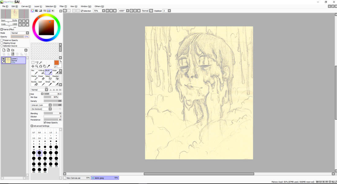
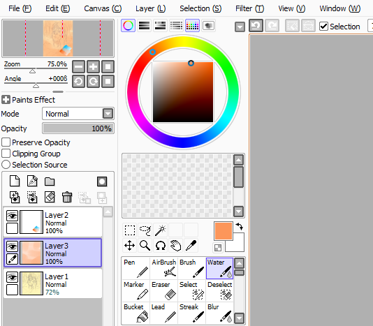
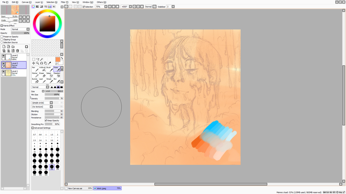
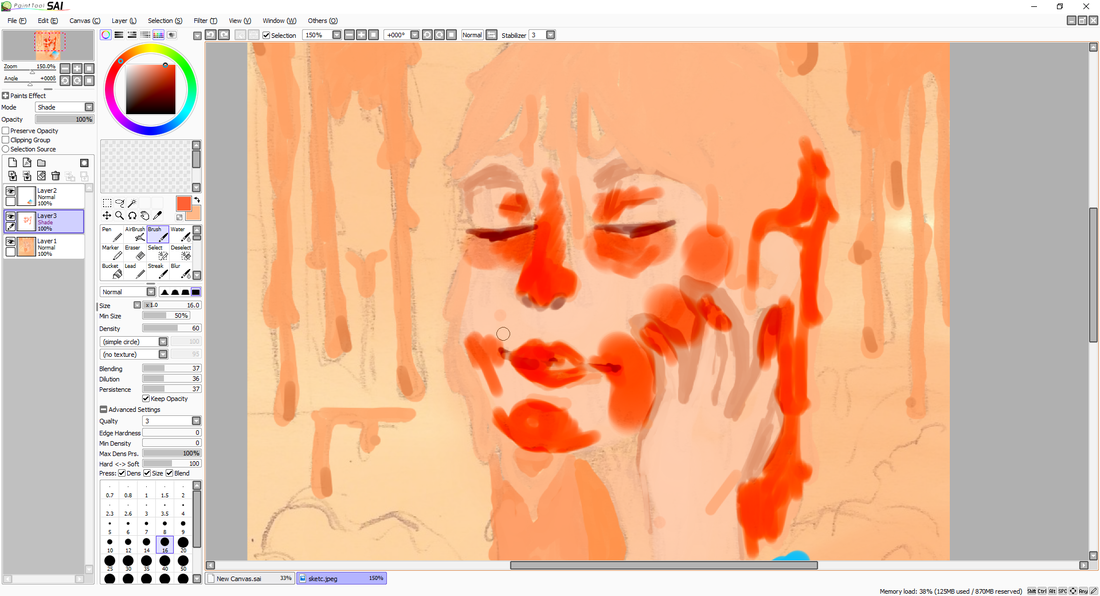
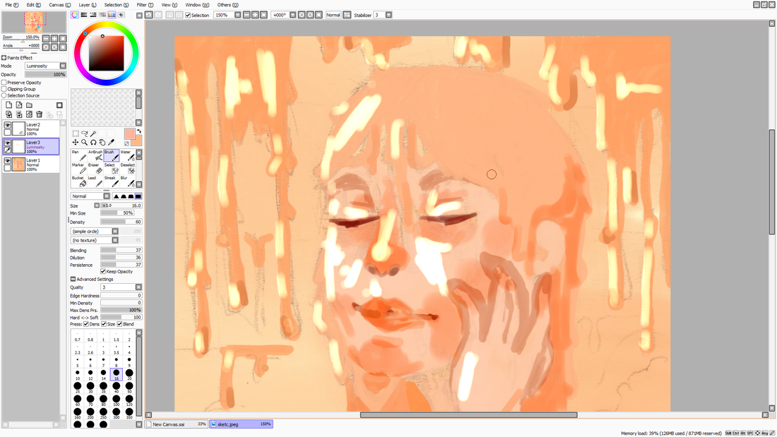
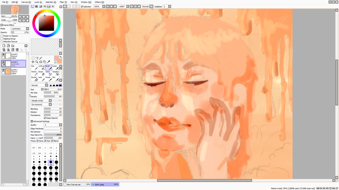
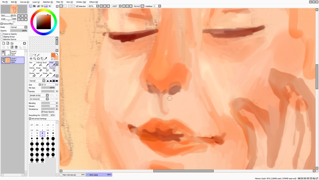
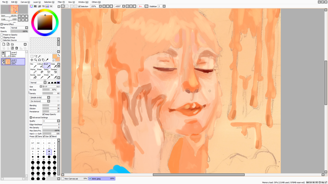
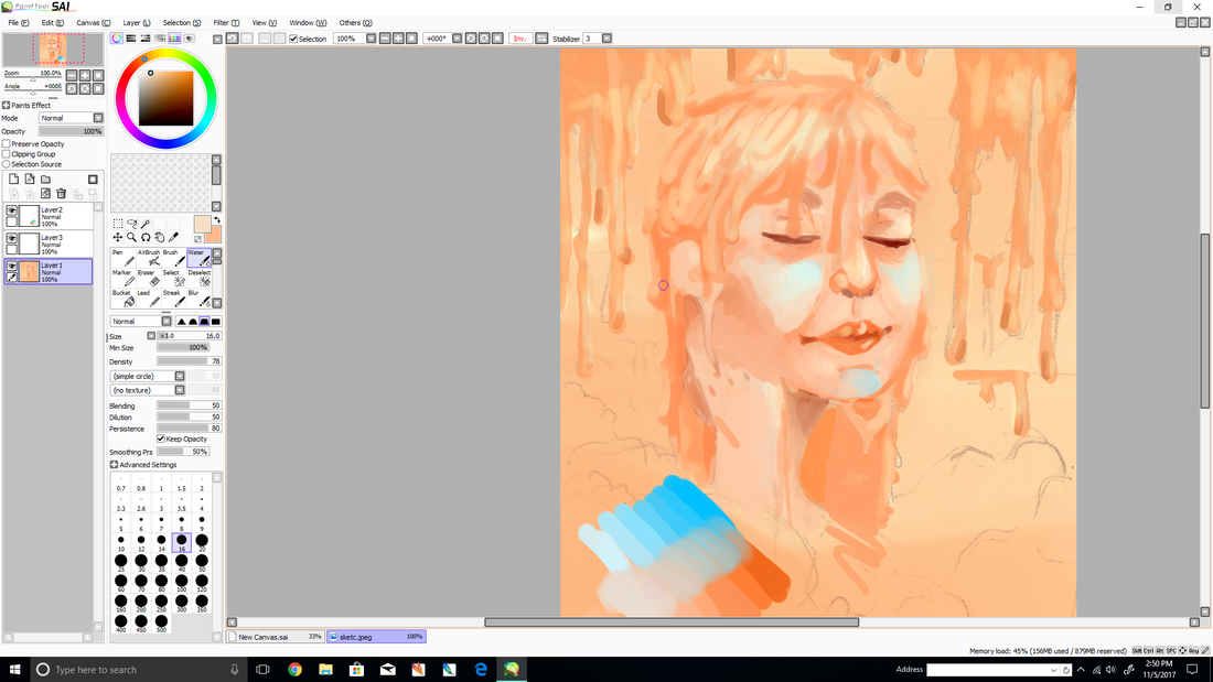
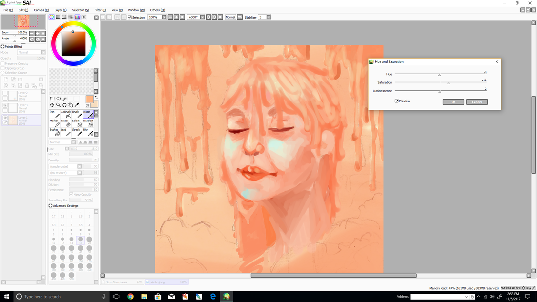
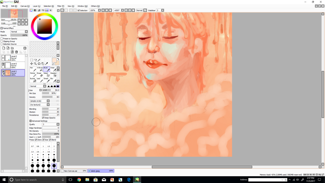
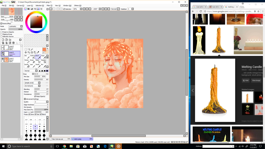
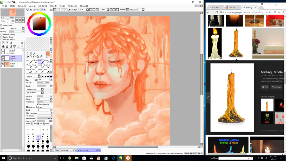
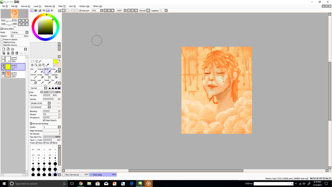
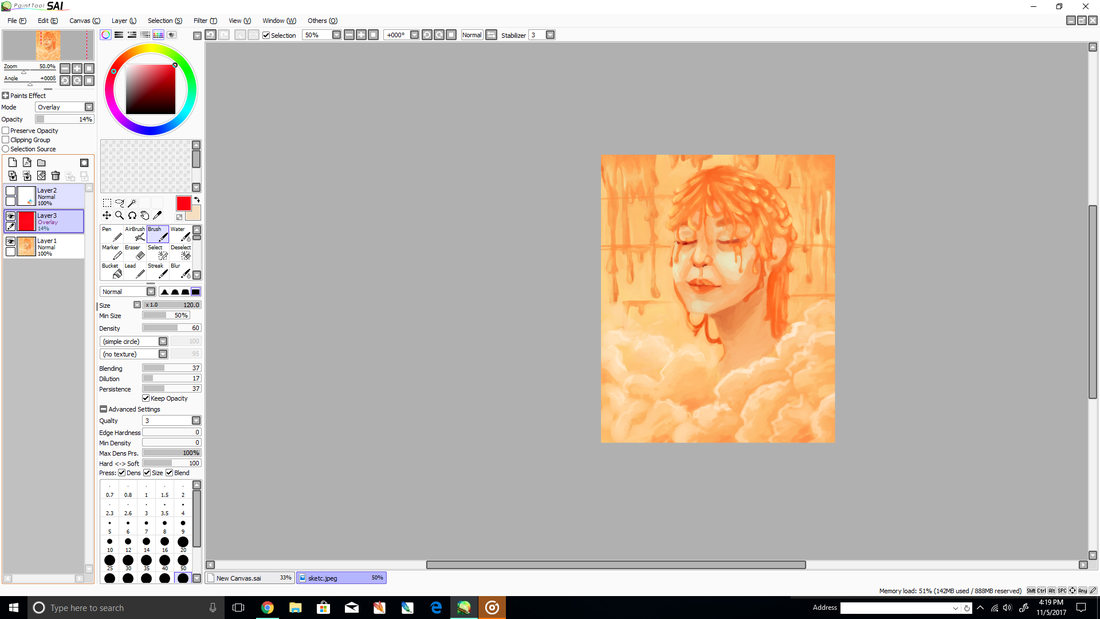
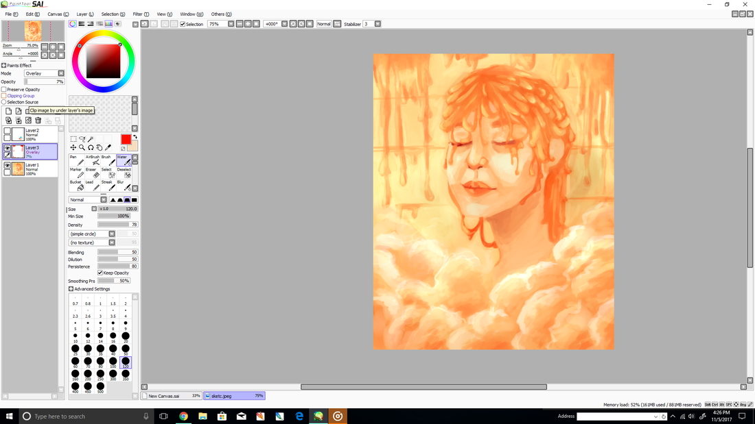
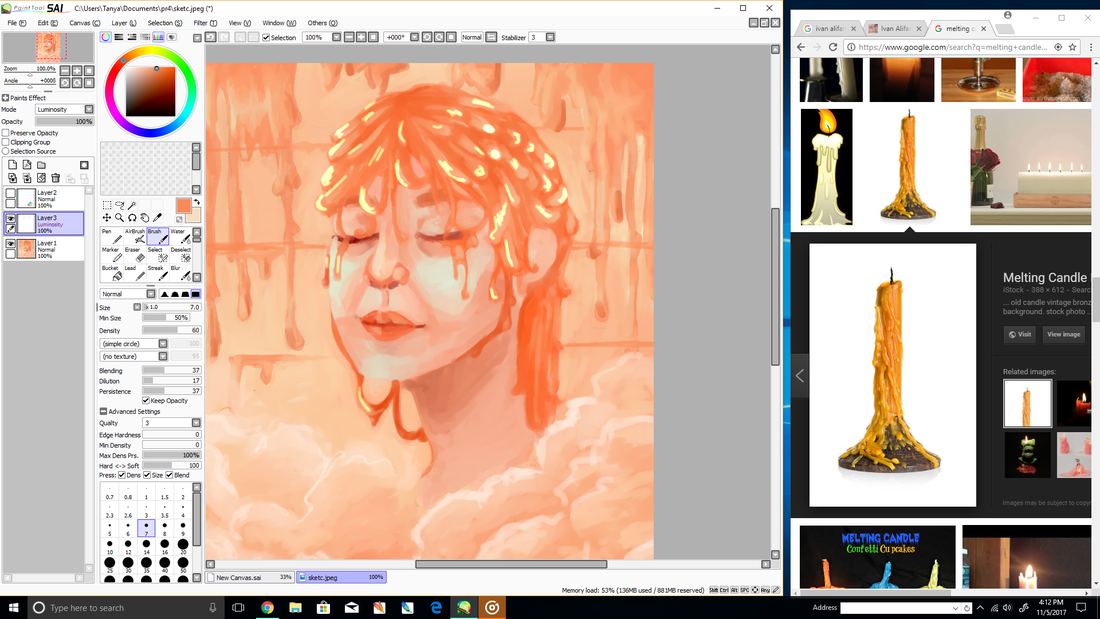
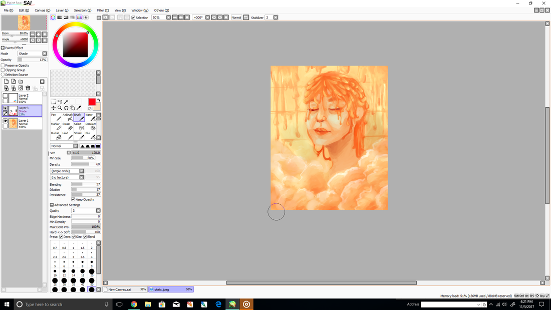
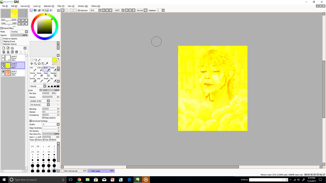
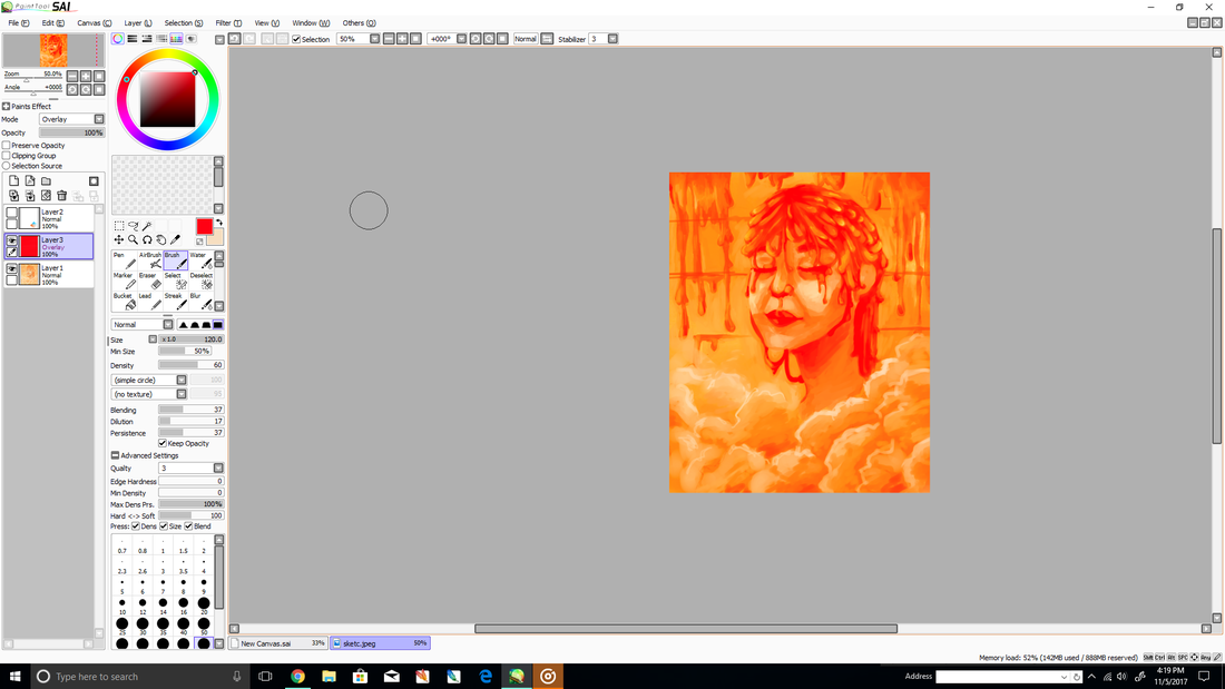
The first step into this process was choosing the size that fit the piece. When creating a new canvas, it would ask what size and the measurement the program should use. I used inches and creating a canvas that is 24 inches by 30 inches to create a rectangular canvas since it was going to be a portrait. Then I used a scanned image of my sketch and used it as an outline for the image. I created a new layer to paint the background into a soft salmon color as the base using the regular brush tool. Then using a color palette and a new layer, I changed the normal layer into a shadow layer to create a bright, saturated, red-orange color for areas such as the nose, chin, eyes, walls and hair. I lowered the opacity and merged the layer into the main layer to use it as the shadows in the face. I repeated the process but instead of changing the layer into a shadow layer, I changed it into a luminosity layer. The luminosity layer is used to create highlights in an image. I then used the water brush tool and the dropper to paint, blend and define features and details. I then used a bright blue on the cheeks in order to blend into the orange because it compliments orange and made the cheeks brighter. Pulling up a reference image of a melted candle I started shaping the hair. I used different orange values to create a gradient in each streak and drop shape. The round end of the wax would be brighter and the opposite end would be a darker value. Using the overlay option for the layers, I painted the entire piece a red hue with a low opacity to make the piece slightly have a pink hue, then I merged it into the main layer. I repeated the process but with an overlay of a bright yellow hue. This make the image have a warmer, less intense color. I added a final layer with the option shade to make the certain areas such as the shadows of the steam and the wall wax darker. |

Experimentation
|
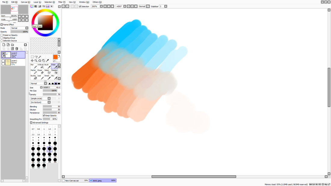
I experimented by creating a gradient of different orange and blue values to have as a reference for creating a piece. I also explored the different layer options for creating shadow and highlight. I ended up using the options called luminosity, shade, and overlay. To correctly use these options I had to lower the opacity so the colors wouldn't be intense and overwhelming. I used saturated reds and browns in the steam to add shadow. Highlight was mainly used the person in area like the nose, cheeks and hair. Overlay was also used to change the hue of the overall piece. Using this option, I used yellow and red over one another to create a brighter, salmon color.
|
|
Reflection
I enjoyed making this piece and I was overall happy with the result. It was an art piece that refreshed my mind on how to use Paint tool sai and learn the general shortcuts. Something I would change about the piece is fix areas I think made be a a little muddy such as the hair. I had a difficult time figuring out where to place the different streaks and to help myself I decided to pull up reference images of both my inspiration and a melted candle. Also I noticed that the image wasn't perfectly balanced, it is slightly more to the right than in the center. If I would to recreate this image, I would pay more attention to the background and add more detail to the running wax on the walls in order to better show that is in a bathroom. Looking back on the steam in the image, it would have been a good idea to paint shoulders as if they were being covered by the steam. In order to do this I would paint the shoulders and create a new layer at a lower opacity, create the steam clouds around the shoulders and merging it with the main layer.
Salvador Dali's pieces are very surrealist and I attempted to do something in accordance to the surrealist movement but still have aspects that Ivan Alifan has in his pieces. I used Alifan's pieces as reference for where the wax would streak down a person's face. Zooming onto the individual streaks themselves, I noted where the light was reflected and where the shadows would be on the liquid substance. His artworks are also very balanced and there is very little space in the background having the viewer focus on erotic image in front of them instead of looking the other way. On the other hand, Dali has several focal points in his pieces and there tends to be large open spaces such as 'The Persistance of Memory'. I decided to do something balanced and surrealist in order to give the message. The message was derived from Dali and his concept of time. It made me think about the feeling someone gets when taking a hot shower as well as the colors that can be interpreted from that feeling.
Salvador Dali's pieces are very surrealist and I attempted to do something in accordance to the surrealist movement but still have aspects that Ivan Alifan has in his pieces. I used Alifan's pieces as reference for where the wax would streak down a person's face. Zooming onto the individual streaks themselves, I noted where the light was reflected and where the shadows would be on the liquid substance. His artworks are also very balanced and there is very little space in the background having the viewer focus on erotic image in front of them instead of looking the other way. On the other hand, Dali has several focal points in his pieces and there tends to be large open spaces such as 'The Persistance of Memory'. I decided to do something balanced and surrealist in order to give the message. The message was derived from Dali and his concept of time. It made me think about the feeling someone gets when taking a hot shower as well as the colors that can be interpreted from that feeling.
ACT Questions
1) How are you able to identify the cause-effect relationships between your inspiration and its effect upon your artwork?
Dali concept of time and destruction caused me to think about the end of the day, where everything winds down and a person gets ready to go to sleep. Alifan inspired me to use softer, more pastel colors instead of a brighter more saturated values.
2) What is the overall approach the author has regarding the topic of your inspiration?
The author for Alifan's biography was very straight to the point, describing his goal and achievement. The author for Dali was very in depth with the analysis of his pieces and appreciative.
3) What kind of generalizations and conclusions have you discovered about people, ideas, cultures, etc. while you researched your inspiration?
I can conclude that people who aren't as unfamiliar with art or chose to only think about a piece based on style rather than meaning, can become embarrassed or shy when coming across a erotic piece.
4) What was the central idea for theme around your inspirational research?
The central idea for my piece was the state of a person after a long day, where they wish time would stop for a while.
5) What kind of inferences did you make while reading your research?
An inference I would make is that Dali's pieces can be difficult to interpret because of how surrealist the images are.
Bibliography
Alifan, Ivan. “Not Milk.” IVAN ALIFAN - Contemporary Figurative Artist, 2011, www.ivanalifan.com/about.html.
Goff, Robert. The essential Salvador Dalí. Barnes & Noble, Inc., 2007.
Shabi, K. “Salvador Dali Persistence of Memory: Meaning of the Melting Clocks.” What is the Meaning: Online Literary Journal & Magazine, Legomenon, 29 May 2014
Goff, Robert. The essential Salvador Dalí. Barnes & Noble, Inc., 2007.
Shabi, K. “Salvador Dali Persistence of Memory: Meaning of the Melting Clocks.” What is the Meaning: Online Literary Journal & Magazine, Legomenon, 29 May 2014
